Test Design & Procedure
Two different user tests were conducted, one for the on boarding process of the translators and the other one for the communication possibilities within the CAT editor.
A remote test setting was chosen, since the interface is built for users from different countries it is essential to test with users from different nationalities.
Quantitative measures, for example task completion was considered and the overall user satisfaction was obtained at the end of the tests.
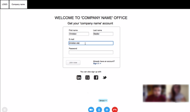
Task 1: Please sign up for an account at the platform. You can use test data. Please enter just one mother tongue ‘German’
Task 2: You got the verification email. Please follow the link in the email. Please do not leave the page for this task. What would you do next? What possibilities do you have? Please tell the moderator how your procedure would look like.
Task 3: Extend your profile: add another language: English (british); and add a short summary about yourself and view your profile.
Task 4: Navigate to the dashboard of the platform. What possibilities do you have? Tell me what your options are and what you would choose to do. Please tell the moderator your thoughts.
Task1: Please explore the platform, but do not leave the page for this task. What is your first impression? Tell me what you can manage via the dashboard and what information do you get? I there anything you want to add to it? Can you get information?
Task 2: You want to go on with your current translation job. Please navigate to the project and start translating. You come up with the word ‘technician’ in the second segment, which could either be a ‘tecnico’ or a ‘mecanico’. You need more information about the translation context. What would you do? Please do not execute the task yet. Explain your approach to the moderator.
Task 3: You are under time pressure and need to finish the translation. Please contact the project administrator and tell him about the problem with the segment.
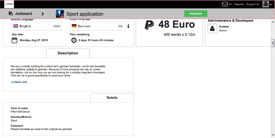
Task 4: You are interested in a new job. How would you proceed to find a new one? Pick the newest job offer and look for job details -do you have enough information to accept the job? If yes accept it.
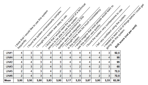
To get an overall feedback of the users the System Usability Scale (SUS) by Brooke (1986) was used.
The questionnaire consists of ten statements related to a global view of subjective assessment of usability. (Sauro, 2011)
Half of the 10 statements are worded positively and half negatively.
- I think that I would like to use this system frequently.
- I found the system unnecessarily complex.
- I thought the system was easy to use.
- I think that I would need the support of a technical person to be able to use this system.
- I found the various functions in this system were well integrated.
- I thought there was too much inconsistency in this system.
- I would imagine that most people would learn to use this system very quickly.
- I found the system very cumbersome to use.
- I felt very confident using the system.
- I needed to learn a lot of things before I could get going with this system.
The responses are given in a five-point scale, ranging from strongly disagree to strongly agree.
Results & Recommendations
The success rate was hundred per cent and the error rate was equal to zero, which means that all the participants were able to execute all tasks without any major error.
While observing the users it was noticeable that some pages already became too long and scrolling was automatically initiated. Due to the fact that the navigation bar at the top of the page includes important call to action buttons it became unhandy to scroll down and up again.
Recommendation:
A fixed navigation enables users to access the important information and actions all the time. This design solution was chosen over for example an additional button at the bottom, because duplicated elements were tried to be avoided.
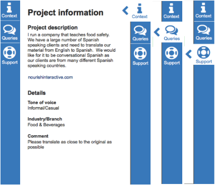
Most of the participants were not sure about the meaning of the icons used for the fade-out menu at the CAT editor. The users should not be left in a state of uncertainty and some hints about the content of those tabs should be given to them.
Recommendation:
To support the icons labels should be used, the wording was chosen to give users additional hints and to represent the most important actions to translators. Furthermore the menu would also benefit from highlighting the three separate tabs more.
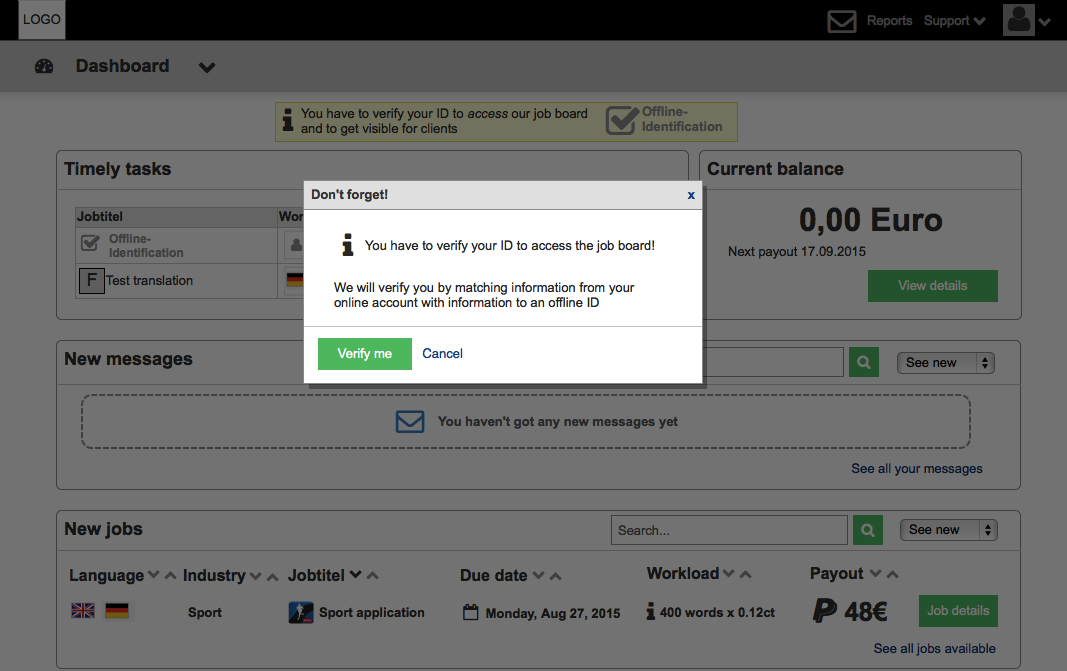
Also the restriction of the dashboard was not realised by the participants and thought to be an error at the page. Even it was an interim solution for the prototype to shade everything grey, to quickly demonstrate the disabled function, it was still thought a more satisfying solution by displaying the content, but restricting the access could be reached.
Recommendation:
Instead of disabling the section the content should be shown as usual. When a translator wants to access, for example the job details from the dashboard, a notification would appear that indicates the key conditions to get access and link to the required action of the user. Because users would now be able to explore the dashboard and already be interested in the information, they are more likely to make the required entries in the profile. This design solution is similar to the approach of LinkedIn. Users with a basic account can see all the provided services, but can only use some of them. When a user wants to use the restricted ones, they get the notification to subscribe as a premium user.
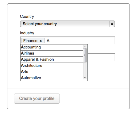
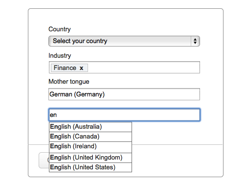
The input field for ‘industry’ in the setup form does not allow translators to choose more than one industry. The users note that they have currently more than one Industry that they are focusing on.
Recommendation:
The dropdown should be changed to an input method, which allows a multiple selection. As in Figure 36 displayed it was changed to an input field with autosuggestion.
While adding another language, participants assumed to find the language settings in the section ‘language pairs’. The position underneath the more general information is less advantageous.
Recommendation:
To gain a bit space at the bottom of the profile and make the language settings more obvious, it would be a good choice to situate the languages close to the language pairs and define a common heading ‘language and services’.


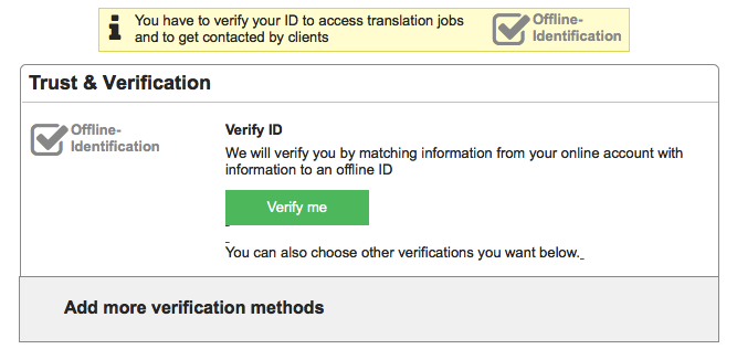
The infobox at the edit profile screen was mostly ignored by users, this could result from the position of the box. The box at the dashboard was noticed by every participant.
Recommendation:
A centered box above the element can be used to be consistent with the design of the infoboxes and make them more noticeable to the users. The text should be more clear too and was changed as well.
After some changes at the signup were made, the label 'language' was replaced by 'mother tongue', which automatically sets the proficiency status to ‘native’. Because users were not able to change it, they were sceptical upon it.
Recommendation:
The proficiency status should be removed from this screen completely.
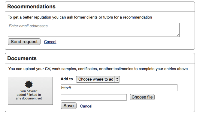
Users noted some ambiguity at the education, recommendation and documents sections on the profile editing page, due to missing or unclear wording.
Recommendation:
At the section education ‘School’ was used as a title, it would be less restrictive to use a more general wording like ‘Institution’, so that users feel more free to add any of their education relevant to their translation career. The section ‘recommendation’ and ‘documents’ should be complemented by a short description to provide a clearer picture to the user.

